Problem Statment
To empower clinic administrators and managers with an intuitive, data-driven dashboard that provides real-time insights into revenue, patient metrics, payment breakdowns, and doctor-wise performance enabling better decisions and streamlined operations.
1. Empathize: Understanding the Users and Their Needs
The first step was to deeply understand the daily workflows, challenges, and priorities of our primary users—clinic administrators, operations managers, and finance officers.
Target Users:
Clinic administrators
Operations managers
Finance teams
Research Methods:
Contextual Inquiry: We shadowed 4 clinic managers during their typical reporting hours—morning huddles, shift changes, and weekly review meetings—to observe how they accessed and interpreted data.
Observed workflows during morning huddles, weekly reviews, and finance close-outs
Noted tools used (Excel, WhatsApp, legacy portals) and pain points in reporting
Cross-Team Surveys (30 responses): Asked about frustrations with tools, report access, and data accuracy
Surveys (30+ responses):: Sent to cross-functional stakeholders (e.g., front desk supervisors, finance clerks, medical coordinators) to validate pain points around reporting and performance visibility.
Interviews (25+):
Conducted in-depth interviews with clinic administrators and regional operations heads to identify gaps in existing systems and understand which metrics they care about most.
Key Insights:
Users often had to access multiple tools—old portals, Excel reports, emails, and finance apps—to get a complete picture. There was no unified view, which meant decisions were often based on outdated or incomplete data.
Admins couldn’t track same-day fluctuations or emerging trends. For example, a drop in revenue from one department could go unnoticed until the end-of-week report, making it hard to course-correct in time.
Doctor-wise performance was buried in exported spreadsheets or Excel pivots. Regional heads found it hard to identify which practitioners were under- or over-performing at a glance.
2. Define: Framing the Problem
With the insights from the Empathize phase, we defined the problem clearly:
Problem Statement:
Clinic managers and finance teams struggle with disconnected data systems and poorly structured dashboards, resulting in delayed insights, inefficient decisions, and a reactive, rather than proactive, approach to performance management.
Design Objectives
Provide instant, high-level visibility into financial and operational metrics
Allow easy filtering by doctor, department, location, and time period
Enable comparisons and trends without needing exports or spreadsheets
Present data visually and interactively to reduce time-to-insight
3. Ideate: Brainstorming Solutions
Our team conducted brainstorming workshops and design studio sessions with stakeholders to generate dashboard layouts, visualization styles, and user workflows.
Key Ideas Explored:
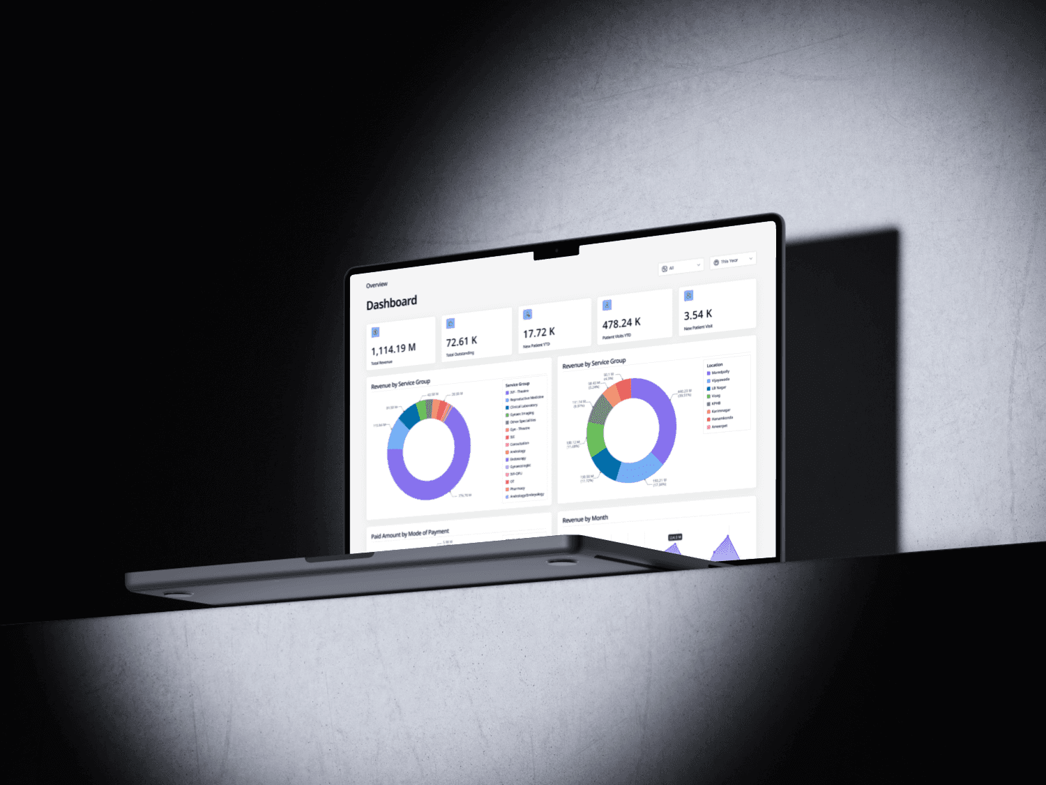
Summary KPIs for Total Revenue, Outstanding Amounts, New Patient Visits, etc.
Donut and Pie Charts to visually break down revenue by service category and location
Monthly Trend Lines to help detect seasonal dips or peaks
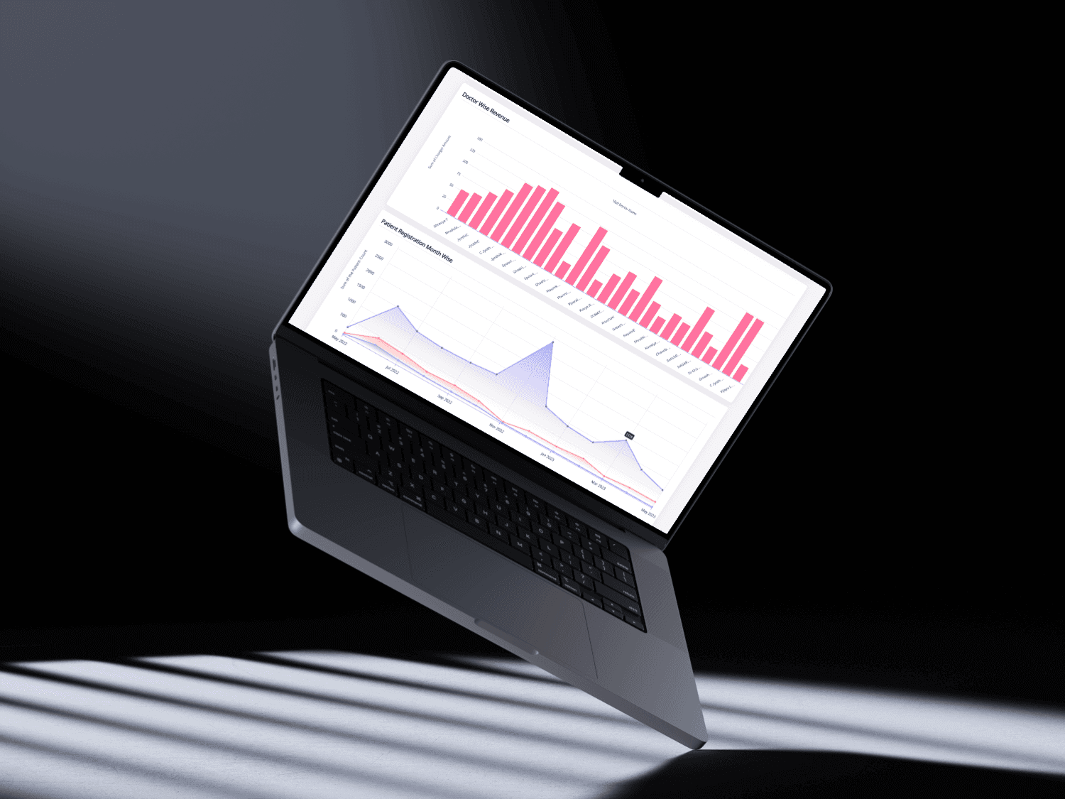
Doctor-Wise Bar Graphs for performance ranking
Smart Filters that apply globally across the dashboard
YTD and MTD Tables for precise, exportable reporting needs
We also reviewed dashboards used by enterprise EMRs and healthcare CRMs to benchmark best practices and common pitfalls.
4. Prototype: Bringing Ideas to Life
We translated our concepts into low-fidelity wireframes and then into high-fidelity prototypes using Figma. Each design iteration went through feedback cycles with 3–5 stakeholders.
UX Principles to Improve Scheduling Experience
Cognitive Load Theory:
We organized information into modular cards and sections, reducing mental effort by prioritizing the most relevant data at the top.Recognition Over Recall:
Charts and color cues helped users instantly spot performance drops or changes without having to calculate or recall previous values.Hick’s Law:
We kept filters to a minimum—Location, Date Range, Doctor—to reduce complexity and decision fatigue.Preattentive Processing:
We used preattentive attributes like color saturation and shape to help users spot anomalies (e.g., revenue dips, outliers) without needing to read every label.Error Prevention (Nielsen’s Heuristics):
All charts and tables were clearly labeled, tooltips were used to explain ambiguous metrics, and interactivity was designed to prevent user confusion.
5. Design and Iteration:
Tools Used:
Figma for UI design
Maze for usability testing
Miro for collaborative ideation
Iteration Examples:
Moved "Doctor-Wise Revenue" higher in layout after users said it was more valuable than patient registration trends
Refined color contrast and added light/dark modes for accessibility
Added tooltips on financial charts to help newer admins understand category labels

Final Deliverable Features
Top KPI Summary Cards
Real-time values for Revenue, Outstanding, Visits, New PatientsRevenue by Service Group & Location
Donut charts to compare contributions and performancePaid Amount by Mode of Payment
Visual split by cash, card, cheque, onlineMonthly Revenue Trends
Line graph with hover points to view monthly comparisonsDoctor-Wise Revenue Chart
Bar graph for identifying top and bottom performersPatient Registration Trend
Line chart + tables for YTD and MTD registration volume by patient type
📈 Impact
Reduced reporting time from 4 hours/week to 30 minutes/day
Enabled same-day visibility into dips or spikes in revenue
Helped regional directors identify low-performing departments early
Future Scope
Integrate AI-generated insights (e.g., “Dr. X has 15% drop in revenue this week”)
Role-based dashboard modes (Finance, Operations, Clinical)
Real-time alerts for anomalies or milestones